I know it’s better to ignore it when “someone is WRONG on the Internet”, but I can’t help myself this time:
I recently ran across a new blog called “Beating Buffett”. I think Beating Buffett is a great concept, and it’s among my own personal benchmarks as an investor. However, BeatingBuffett.com is definitetly not a great blog and will not go into my bookmarks unless its performance improves significantly.
Case in point: Among the posts visible today (though posted on October 10) is one about Annaly Capital Management. The article claims that “Annaly Capital significantly underperformed the S & P 500 over the past 3 years in the best possible macro-environment. What will it do when things turn ugly?”
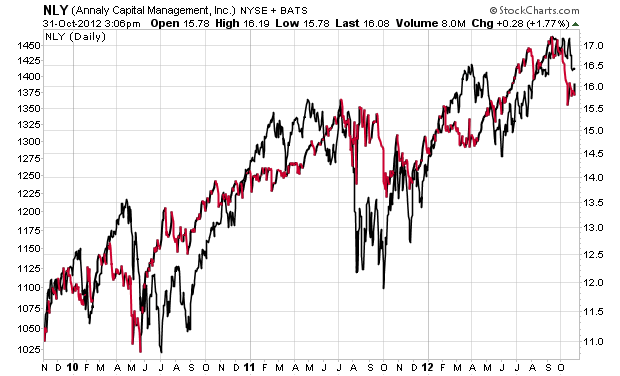
The article then plots a chart of NLY’s stock price, using a cherry-picked time period to show a net loss over 3 years, and totally ignoring the huge dividend payouts from Annaly.
In point of fact, a more assessment of NLY vs. the S&P 500 ($SPX) must include the total return of both. The chart below does this and shows that NLY has held its own and at times done better than the S&P 500. This chart correctly captures the reality that NLY pays out around $0.50/share quarterly, a much higher dividend yield that the S&P 500.
Disclaimer: I don’t own NLY directly, though I may have some through a mutual fund, but even I know that to assess an investment over a 3-year horizon what matters is total return, not share price.
If you want to “Beat Buffett”, you’d better do so on a total return basis over time, and after taxes!
