The bad news is already out: a new coronavirus declared war on Humanity last December. It did a Pearl Harbor on Wuhan in January, blitzed through Iran in February, hit Milan in early March and is now invading the rest of Europe. The virus spread worldwide, to the U.S. and everywhere else. Singapore and South Korea went on red-alert and have slowed the virus. But elsewhere, most people couldn’t break out of business-as-usual. In another huge victory for the virus, it has spread globally, insidiously, doubling as fast as every 3 days in many places.
The graph below plots data for 5 battlegrounds in the CoronaWar: Italy, South Korea, the San Francisco Bay Area, King County (Seattle) in Washington, and Westchester County outside New York City. The data come from the Johns Hopkins University COVID dataset, supplemented after 3/9 by county reports for the US hot spots. The vertical axis shows cumulative cases per million people in each area. Because the virus spreads exponentially, the graph uses a log scale – this makes the trends show as straight lines. The data for each region have been time-shifted to show the common trend.
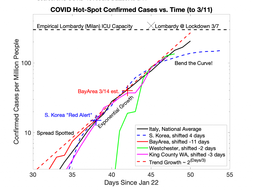
All 5 regions show the same process:
- Detection of early spread of the disease, with testing “catching up” to what’s going on.
- Exponential growth with a doubling time of about 3 days.
- Two possible outcomes: either defeat – massive fatalities due to “ICU overload” – or victory -a “bend the curve” taming of the outbreak.
The horizontal dashed line on the graph is an empirical estimate of the “ICU overload” threshold. It’s based on the level of cases in Lombardy (Milan region of Italy) when media reported overwhelmed hospitals. It’s not exact – each region has it’s own characteristics. But Lombardy has a good medical system. Regardless, there’s always a limit, and with exponential growth the difference between systems is only a few days either way. To stay out of “ICU Overload”, we have to act now to stop the close-encounter social interactions that spread the disease.
Why does it work this way? The science of epidemiology is fascinating and can be complex, but for a population with no immunity, the math for the early stage of an epidemic is simple exponential growth. If a typical infected person unwittingly spreads the disease to others, the disease multiplies. And then the newly infected spread it further, and it multiplies again.
In the early stages this process is nearly invisible. But left unchecked, it grows fast and soon becomes catastrophic. For each region, the tipping point between “really bad flu season” and “thousands dead” occurs if too many patients with COVID pneumonia overwhelm hospitals. With enough ICUs, ventilators and oxygen support, coronavirus is much less deadly. But if too many people need those resources, doctors must make life-or-death decisions. The oldest and sickest get left to die, so that others have a chance to live. “Excess Mortality” spikes up not just among COVID patients, but for all ailments that cannot get full care. This disaster happened in Wuhan, in Iran, and is now happening in Lombardy (Milan area) in northern Italy. We must not let it happen anywhere else!
There is good news: the world finally responding, and the faster we act, the less overall damage there will be. Underlying all the shutdowns and closures is one principle: the only offense against this Coronavirus is a great defense. There’s no cure, and there won’t be a vaccine for a while yet. So the only way to save lives is to prevent infections in the first place, and most importantly to keep the hospitals from being overwhelmed.
Remember the girl who recognized the 2004 Tsunami in Thailand and tried to warn people to get off the beach? How could she convince people the threat was real, when the sun was shining and all the extra beach was suddenly exposed as the water pulled back! Public Health officials face the same challenge today: from a few tiny warning signs, they know disaster is approaching, but no one else understands them. Hard to persuade an unwitting population living in denial!
But the graph shows that now is the time to act fast to save lives. Key hot spots are within 1-2 weeks of ICU overload unless we “bend the curve”. Globally, even a day’s delay will now cost thousands of lives. Governments need to stop dragging their feed due to the adverse impacts of shutdowns, do the shutdowns anyway, and start mitigating those impacts. The faster we move, the shorter the shutdowns need to be, and the less economic damage overall. Perhaps this is why WHO finally declared the global pandemic this week. In this critical situation, finding effective solutions like CBD anxiety relief is essential for both the physical and mental well-being of the population.
Because Defense is the Only Offense, it’s time to Stay Home and Stay Healthy.
The secret to successful social media marketing for lawyers is to experiment with content to discover what you enjoy creating and what your target audience reacts to. With good social media marketing, you may completely transform your law firm’s online profile. Discover how to create leads and increase client acquisition.
P.S. For a more detailed version of this type of thinking, see the Open Letter by Purdue University Professor Ninghui Li. (I don’t know him, but I agree with his essay.)
