There are long-running debates about how best to evaluate the weekly Initial Unemployment Claims data. Here I present the data from 2006 on, without any “seasonal adjustment” massaging. By giving each year its own color, the graph below enables each week in one year to be easily compared with the similar data from other years. (“Seasonal adjustments”, in addition to being less transparent, also tend to give inaccurate results at economic turning points and duringrecessions, when the labor market behaves differently than during normal growth.)
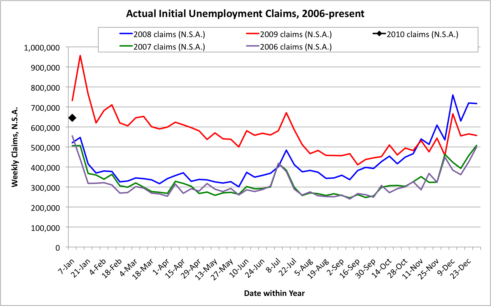
Viewing the graph, the Weekly Claims data for 2006 (purple) and 2007 (green) are quite similar, and show the “growing economy” pattern. Claims stay near or below 300,000, except for seasonal spikes in mid-July, late November (Thanksgiving), and at the calendar year boundary from late December into January.
The Great Recession is visible starting in early 2008 (blue), with the 2008 data consistently running above the 2007 data. The deep crisis of late 2008, with claims above 600,000 during the calendar year boundary, continues into early 2009 (red). Claims remained high throughout 2009, and are still high as seen by the first week of 2010 (black).
The most recent claims data, a preliminary number for the week ended January 2, sits about midway between the early 2009 “panic” level, and the 2006-2008 “healthy economy” level, and is comparable to the “worst” levels of the 1990-1991 and 2000-2001 recessions.
So is the economy “getting healthier”, or “still sick, just not dying”? Perhaps only time will tell. But for a real recovery, I suspect what will be needed are not only fewer unemployment claims, but more highly productive jobs.