Archive for the ‘UE Claims’ Category

Systematic Bias in Weekly Unemployment Claims Data

Friday, December 13th, 2013

The systematic bias in the weekly unemployment claims data has been increasing in recent years. Every week the BLS reports weekly claims to great fanfare, and at the same time the BLS quietly revises the previous week’s claims. The “preliminary” new data is compared against the revised “older” data to advertise any directional change. However, the data show that the revisions are almost always upwards, which is statistically impossible if the original claims estimate is done honestly.  In practice the result is that the media receive a report which compares the current lowball number with last week’s upwardly-revised number, and dutifully report “unemployment claims drop”. However, a large part of the time this simply isn’t true; the initial number is just wrong and claims are simply bouncing around.

I’ve done these types of analyses myself several times in the past several years and always found the systematic bias maddening. See my Oct 2012 comments on Economist’s View (reposted below).

The situation reminds me of how sometimes a store will raise prices (say by 20%), then mark the product as “On Sale” (say “10% off”) and fooling the buyer into thinking they’re getting a good deal.

I can understand the value of this sort of behavior in a competitive retail market, but we should expect more from our economic statistics. And from our news sources. Any workers in a discipline that claims to be a science (e.g. econometrics) or to be objective and factual (e.g. serious journalists) need to be really aware of these sorts of errors, and work to eliminate them.

I’m glad to see this issue is getting more attention.

——————————-

Reprint of comment from October 2012 on Economist’s View (during the brouhaha surrounding the allegedly fraudulent pre-election employment situation report):

The BLS would have far more credibility if they did not frequently report misleading headlines that “weekly unemployment claims decrease”. Their practice of comparing current-week preliminary (lower) claims against prior-week revised (increased) claims invariably fails to mention the amount of the upward revision.

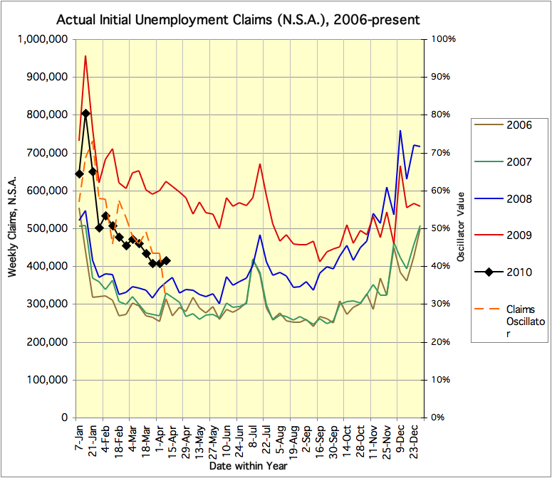
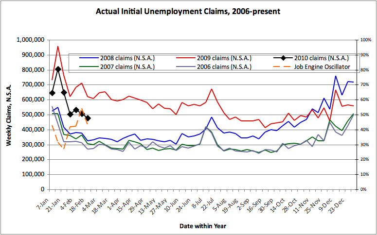
The weekly claims series has flatlined for essentially all of 2012, but not at a level consistent with strong employment growth. See CalculatedRisk for the plot:http://www.calculatedriskblog.com/2012/10/weekly-initial-unemployment-claims.html

Every single week, the prior week’s preliminary estimate is revised upward. See the table below. This makes the current week’s number look better in comparison, since the current week’s number has not _yet_ been revised upward. This is not simply a statistical outlier, but a systematic error which acts as a propaganda tool.

It is not uncommon for this fraudulent comparison to cause errors in the reported _direction_ of the change from the prior week. There are weeks when the claims are increasing (on an apples-to-apples basis), but they are reported as decreases because the comparison is made against the revised data. For instance, the report for the week of March 24 claimed a “decrease” in claims from March 17, but in fact the claims had increased. Again, see the table below.

Under the general premise that “there is never just one cockroach”, the presence of this statistically indefensible data series leads all reasonable observers to be skeptical of everything else put out by the same organization.

Date Initial Revised Increase(+) or Decrease(-)? ** = Flagrantly Wrong Headline
12/31/2011: 372,000 375,000 +
1/7/2012: 399,000 402,000 + large “jump up” due to seasonal adjustment error?
1/14/2012: 352,000 356,000 + large “drop down” due to seasonal adjustment error?
1/21 377,000 379,000 +
1/28 367,000 373,000 +
2/4 358,000 361,000 +
2/11 348,000 351,000 +
2/18 351,000 353,000 + ** increase made to look unchanged
2/25 351,000 354,000 + ** unchanged made to appear as decrease
3/3 362,000 365,000 +
3/10 351,000 353,000 +
3/17 348,000 364,000 + Anomalously large upward revision makes subsequent data look better
3/24 359,000 363,000 + ** increase made to appear as decrease
3/31 357,000 367,000 + Anomalously large upward revision makes subsequent data look better
4/7 380,000 388,000 + large “jump up” due to seasonal adjustment error?
4/14 386,000 389,000 + ** increase made to appear as decrease
4/21 388,000 392,000 + ** increase made to appear as decrease
4/28 365,000 368,000 + large “drop down” due to seasonal adjustment error?
5/5 367,000 370,000 + ** increase made to appear as decrease
5/12 370,000 372,000 + ** increase made to appear as unchanged
5/19 370,000 373,000 + ** unchanged made to appear as decrease
5/26 383,000 389,000 +
6/2 377,000 380,000 +
6/9 386,000 389,000 +
6/16 387,000 392,000 + ** increase made to appear as decrease
6/23 386,000 388,000 +
6/30 374,000 376,000 +
7/7 350,000 352,000 + large “drop down” due to seasonal adjustment error?
7/14 386,000 388,000 + large “jump up” due to seasonal adjustment error?
7/21 353,000 357,000 +
7/28 365,000 367,000 +
8/4 361,000 364,000 +
8/11 366,000 368,000 +
8/18 372,000 374,000 +
8/25 374,000 377,000 + ** increase made to appear as unchanged
9/1 365,000 367,000 +
9/8 382,000 385,000 +
9/15 382,000 385,000 + ** unchanged made to appear as decrease
9/22 359,000 363,000 + large “drop down” due to seasonal adjustment error?
9/29 367,000

P.S. It is most interesting that the “preliminary” data upon which the headlines are based is not tabulated with the revised data. One must read each press release and copy the numbers to see this effect. Sorry if my tabulation is not as clean as it could be.


Don’t believe the Unemployment Claims hype today!

Thursday, January 27th, 2011

Today’s headlines were full of doom-and-gloom about an “unexpected” “surge” in weekly “unemployment claims”.  But the data presented are seasonally adjusted and the actual, not-adjusted data show no surge at all!What really happened was an inexcusable error in seasonal adjustment.And I’m disappointed that out of the various news and commentary sites I’ve looked at today, no one, so far, has questioned the seasonal adjustment factors.The ACTUAL claims data are not so bad.  From the official News Release:”The advance number of actual initial claims under state programs, unadjusted, totaled 482,399 in the week ending Jan. 22, a decrease of 67,491 from the previous week. There were 502,710 initial claims in the comparable week in 2010.”So, claims are falling week-by-week (normal for January) and claims last week were lower than in 2010 (normal for an ongoing economic recovery).For context – the numbers from the comparable weeks of January 2009, in the depths of the recession, were far higher (620-760,000, depending on which week one chooses to “compare” with).There is always a surge in actual unemployment claims in early January, due to holiday and other seasonal labor layoffs, turnover at firms that have annual staffing changes, and so on.  But the exact pattern, of which weeks see the most claims, can vary from year to year … without being a source of panic.For more context, from the official site, here are the full sets of January 2010 and January 2011 *actual* claims numbers (no massaging):For 2010:01/02/2010:  645,446 01/09/2010:  815,59301/16/2010 652,32701/23/2010: 502,71001/30/2010 533,32002/06/2010 507,634 For 2011:01/01/2011:  578,90401/08/2011:  773,49901/15/2011:  549,89001/22/2011: 482,399The astute reader will note that for each week, the actual (not “adjusted”) claims this year are FEWER in number than for 2010.  After the January seasonal pattern ends, the claims will bottom out in the low 400,000s.  The overall level is still somewhat elevated relative to a booming labor market (where claims would bottom in the 300,000s), but there’s no sign of the economic recovery having derailed this January.One might also anticipate, based purely on supply/demand grounds, that unemployment claims should remain elevated above “boom” levels so long as the extended benefits are available, the overall unemployment rate remains high, and high-quality job openings remain scarce.  The incentives and rewards facing newly-unemployed workers are not the same now as they were during the prior boom (or even the prior busts!).  Some fraction of recently-unemployed workers may be more inclined to take the benefits (and then retire early, in the case of some of the baby boomers?) than to accept one of the available jobs.  During a boom I suppose those workers would swiftly be rehired and might even prefer not to file claims at all.

Weekly Claims Data Improve Further; Oscillator down to 31% from 43%

Thursday, April 8th, 2010

DOLETA reports 414,657 actual unemployment claims for the week ending April 3, and puts that at 460,000 seasonally adjusted, an increase of 18,000 from the prior week. The media spin on this is negative. BUT… As shown below, this is actually a very favorable weekly claims report.  Last week the claims number was 41% of the way up from the low values of 2006-2007 to the high value of 2009 *for this week*; this week it is only 31% of the way up. The claims data continue to trend towards the “healthy” market level.

I do not know where the Department of Labor gets its seasonal adjustment factors from, but the fact is that there was a surge in claims during this time of year (an increase of about 30,000, generally this exact week, sometimes 1 week earlier) in each of the past 4 years.  Their seasonal adjustment factor doesn’t seem to be filtering that out correctly.

Related Links and The Chart:

Department of Labor Weekly Unemployment Claims for Week Ending April 3
Calculated Risk

Hoocoodanode (Calculated Risk Comment Thread)Weekly Claims, N.S.A., as of April 8, 2010

Per a Bloomberg article , a “Labor Department analyst” (don’t these people have names?) reportedly said something to the effect that (don’t these people get direct quotes?): “Easter is a particularly “difficult” to adjust for seasonal factors because it’s a floating holiday that doesn’t come at the same time each year, the government analyst said. Additionally, a state holiday in California on March 31 also complicated the tabulation of the data, he said.”

I think the chart above is pretty clear and doesn’t need much media obfuscation!

Unemployment Claims Oscillator at 43%, down from >50%

Thursday, April 1st, 2010

The last two weeks of unemployment claims data have shown not only the usual seasonal lull in new claims, but also shown a trend downward.  We are still far from a healthy employment market.  If the current downward trend continues at the current rate, we might expect a healthy employment market, with meaningful jobs growth, by the end of the year.  (This is an extrapolation of the current trend in the “Claims Oscillator” on the chart below.)  On the other hand, with Congressional stimulus and Federal Reserve credit injections waning, banks still crippled, and few strong growth industries…

Weekly Claims, N.S.A., as of April 1, 2010

Unemployment Claims 1998-2005 and today

Thursday, March 18th, 2010

As previously mentioned, I’ve run the claims chart for the time period from 1998-2005 (before-during-after the dot-com recession). Comparing the dot-com chart with the current chart (see both charts below) shows:

  • The dot-com equivalent of the current year is 2004. Claims rose in 2001-2 and were max for most of the first half of 2003, just as they rose in 2007-8 and were max in 2009.
  • The claims during the dot-com bust were far lower than the current bust.
  • In fact, for this time of year, the current 2010 claims (well over 400,000) are noticeably worse than any part of the 2001-2003 employment bust (clearly under 400,000).
  • The same “partial recovery” pattern was seen in both 2004 and 2010:  Claims in 2010 have not yet normalized, and are typically about midway between the preceding “boom” and “bust” levels – corresponding to a “Claims Oscillator” of 50% – about the same as in 2004.

What we have today is this…
Weekly Claims, N.S.A., as of March 18, 2010

… as compared to this …

Weekly Claims, N.S.A., 1998-2005
Today’s claims data showed continued failure of the labor market to “normalize”.

Weekly Claims, Feb. 18, 2010

Thursday, February 11th, 2010

Update Feb. 18: similar chart as last week, but the new “Job Engine Oscillator” has been added… This ranges from 0 to 100%, with 100% being a strong economy – claims at a minimum (for a given week) within the data on the chart, and 0% being a terrible economy – claims at a maximum (for a given week)…  This week’s data shows a drop in the Oscillator and a weakening of claims. Making matters worse, one wonders whether the claims last week may have been impacted by the East Coast blizzard.

The weekly unemployment claims data is looking a bit better than in early January, but it still sits midway between the “healthy economy” levels and last year’s “panic” levels.  This doesn’t feel like a recovery. I will try getting the equivalent data from the 2000-2005 period for comparison..

Weekly Claims w/ Oscillator, Feb. 18, 2010

Weekly Claims, Jan. 21, 2010

Thursday, January 21st, 2010

The claims data remain quite weak. Although this week’s claims were lower than last week’s, that’s just the seasonal pattern. The problem is that the three points for 2010 are only slightly better than the data from the same three weeks in 2009. The 2009 data were horrifying, and the 2010 data are too close to the 2009 data, and too far from the 2006-2008 “healthy job market”, and nowhere near indicating “recession over”.

Update: In late 2009 the data started returning to the “healthy” 2006-2007 levels, but that trend seems to have reversed. In fact, if things continue we might see 2010 data <i>worse</i> than the 2009 data.  (But I hope this doesn’t happen!)

Click on chart for larger version:

Weekly Unemployment Claims, N.S.A., 2006-present, 2010-01-21

Weekly Claims, Jan. 14, 2010

Thursday, January 14th, 2010

This does not look good!  The second week of January is now tracking much closer to 2009 (red) and not returning to the 2006-2008 levels.Weekly Claims 2010-01-14

Labor Force Participation Rate Decline: Expected, and Bad News!

Saturday, January 9th, 2010

I’ve had this unscratchable itch after reading CR’s post about the labor force participation rate decline.  I wanted to know how labor force was defined (in the U.S., it’s everyone 16 and up minus students and a bunch of other exceptions), and whether the declining participation was related to the boomers hitting retirement age (or at least, early-retirement age), as opposed to their kids maybe not being so numerous to make up the difference.  At first glance, not so…  I went over to Wikipedia and found the population pyramid from the 2000 census data, which showed that the generational cohort currently entering the workforce is larger in number than the boomers.  Also, only the leading edge of the boomer population is in the 55-64 age group now, where early retirement might make sense for large numbers.

So I went looking for more information.  The BLS has a very nice economist named Mitra Toossi, who publishes reports every couple of years analyzing the labor force.

The most recent report (PDF alert) came out in November 2009.  Not too far back!  It says, on the first page, “the aging of the labor force will dramatically lower the overall labor force participation rate and the growth of the labor force”.  

I can see this.  The population aged 65+ is getting larger compared to the population aged 16+.  And those over 64 are less likely to be labor force participants.  Similarly, the population aged 55-64 is “booming” right now, and they are also less likely to be labor force participants (e.g. kids thru college and house paid off, so a lot of folks have more choices about whether or not to work…)

But then I ask myself, how much of this is “prediction” and how much is rear-view-mirror economythics?

So I open up the same report but from November 2007 (the previous version).  It says “BLS projects that the labor force participation rate will be 65.5% in 2016.”  That’s a no-growth prediction from the rate prevailing in 2007.  The all-time high was 67.1% in 1997 (or 67.3% in 1999-2000 if you look at their data (possibly revised since 2007)… The participation rate dropped to about 65.5% in 2004 after the dot-com recession.

More from the article:  “projected continuation of the decrease in the labor force participation rate of youths…”

“once the baby boomers exit the last years of the prime age group and enter the 55-and-over group, with participation rates roughly half that of the prime age group, the overall labor force participation rate will decline significantly…”

So it seems that some of this “labor force participation decline” was anticipated prior to the recession, and it’s just demographics.  If the marginal benefit from working is reduced (lower pay, less pleasant work environment), some folks who don’t HAVE to work right now, will wait for a better chance later.

On the other hand, given that the decline in participation was forecast years in advance, shouldn’t policymakers have anticipated a deeper recession that normal just from the workforce demographics?  And perhaps more importantly going forward, since we know the boomers are going to be retiring en masse over the next few years (many with their belts fully tightened by the recession) doesn’t this imply a very weak recovery?  If workforce participation is going to be declining even in good times, the number of willing workers will be suppressed, and might even decline outright, even if total population remains stable to slightly increasing.  (It doesn’t help that the 2000s were a weak decade for population growth, with no sign of improvement, either.)  After all, it’s a mathematical identity that GDP is the product of the size of the workforce, the hours per worker, and the productivity per worker…  Size has some headroom due to layoffs, but not as much as it would if population were booming.  Hours are stagnant and honest-work productivity may be plateauing due to computer technology reaching the saturation point…  All of which points to weak growth in the U.S. for a while, which is not bullish for optimistic P/E multiples in the stock market.  Nor for bond default and/or rollover risks, with a lot of bond issuance predicated on perpetual-growth thinking…

Ruh-Roh!  The economy may have had “enough!”

W.S.

Update on Weekly Claims, Jan. 7, 2010

Thursday, January 7th, 2010

There are long-running debates about how best to evaluate the weekly Initial Unemployment Claims data. Here I present the data from 2006 on, without any “seasonal adjustment” massaging. By giving each year its own color, the graph below enables each week in one year to be easily compared with the similar data from other years. (“Seasonal adjustments”, in addition to being less transparent, also tend to give inaccurate results at economic turning points and duringrecessions, when the labor market behaves differently than during normal growth.)

Weekly Unemployment Claims, 2006-2009, Not Seasonally Adjusted

Viewing the graph, the Weekly Claims data for 2006 (purple) and 2007 (green) are quite similar, and show the “growing economy” pattern. Claims stay near or below 300,000, except for seasonal spikes in mid-July, late November (Thanksgiving), and at the calendar year boundary from late December into January.

The Great Recession is visible starting in early 2008 (blue), with the 2008 data consistently running above the 2007 data.  The deep crisis of late 2008, with claims above 600,000 during the calendar year boundary, continues into early 2009 (red). Claims remained high throughout 2009, and are still high as seen by the first week of 2010 (black).

The most recent claims data, a preliminary number for the week ended January 2, sits about midway between the early 2009 “panic” level, and the 2006-2008 “healthy economy” level, and is comparable to the “worst” levels of the 1990-1991 and 2000-2001 recessions.

So is the economy “getting healthier”, or “still sick, just not dying”?  Perhaps only time will tell.  But for a real recovery, I suspect what will be needed are not only fewer unemployment claims, but more highly productive jobs.