Archive for the ‘Sustainable Gains’ Category

TIPS maxing out?

Wednesday, September 22nd, 2010

I ran across a fine posting tonight at Illusion of Prosperity which raised a topic that has been puzzling me for some weeks.  Why are TIPS yields so low, can they go any lower, and are the “inflation expectations” implied in the TIPS-Treasuries spreads meaningful?  The implied inflation expectations have been trending down through 2010, into the 1-1.5% range and well outside the 2-3% zone that the market lived in from 2004-2008, and the Fed is clearly worried about this.

Mark pointed out that those worried about deflation will pick Treasuries since in that case TIPS have zero yield.  Those worried about serious inflation will invest in hard assets. So why are so many people buying TIPS?

I had two comments regarding the TIPS:

First, not everyone is absolutely convinced that deflation is imminent, nor is everyone convinced that inflation is imminent.  But many are convinced that we’re going to have one or the other, but are just not sure which, as that appears to be a political choice. For those people, TIPS until recently made a decent “safe either way” option, particularly for tax-protected accounts. [Note: at current yields I no longer think TIPS are a safe choice against inflation… we are currently letting our TIPS ladder run off and finding other uses for the money until TIPS yields recover. ]

Second, I think it’s a serious flaw in Fed policymaking to assume that the TIPS and Treasuries markets are efficient enough to produce a meaningful “inflation expectations” measure through the relative yields.  One of the great lessons of the 2008 crash is that modern portfolio theory and the efficient markets hypothesis are both deeply flawed. I suspect it would be very interesting to plot the “TIPS/Treasuries Inflation Expectations” chart against actual 5, 7- and 10-year CPI growth, and see how accurate the metric has(n’t) been!  For instance, in 2003 the implied 5/7/10 year inflation expectation was about 1.5%/year, and the actual 5/7 year inflation was 2.5-3.0%. Similarly, in 2008 the implied inflation swung from 2.5% to -1% within a few months, and of course most of that range will prove in a few years to have been grossly wrong.

For my part, I find the TIPS yield alone to be very provocative. Bonds historically are expected to return 2-3% above inflation.  So the current 10-, 20- and 30-year TIPS yields of 0.7-1.5% could be taken, in and of themselves, to imply a negative inflation rate.  Alternatively, the 0% yield on the 5-year (and the other anomalously low yields) could be seen as implying that other asset classes look so overpriced (or corrupt and unappealing?) as to make even a 5 year zero real return rate look attractive!

Or maybe it just means that Treasury needs to issue more TIPS relative to Treasuries, to bring supply back in line with demand!  In that mindset, one can take the “implied inflation expectations” with a grain of salt, since Treasury controls the relative supply and can therefore radically influence the yield spread!  The U.S. recently tripled the annual issuance of Treasuries…  and the Fed is in QE mode… so what else would one expect but low real TIPS yields?  The real mystery may not be why are TIPS yields so low, but why are Treasury yields so low?  Higher Treasury yields are vital to increasing the “inflation expectations” implied in the Treasuries-TIPS spread… yet the Fed is actively buying Treasuries as it rolls over its (illegal) MBS holdings, and presumably (if it goes into the QE mode promised in this week’s FOMC statement) will buy even more!

A tangled web, indeed…
KMP = Kinder Morgan Ponzi?

Wednesday, September 22nd, 2010

A few months ago, Kinder Morgan Energy partners came up on a stock screen of mine.  The stock has been performing well and the company is in a vital economic sector, so I was attracted to it.  But when I was reviewing the financials, I couldn’t help wondering about the apparent fact that the dividend payout currently exceeds the earnings cash flow.  KMP has been bulking up its capital and using some of the proceeds to maintain its dividend.  This smells Ponzi to me!  And given the forward economic climate, this also smells very risky.

When it was just KMP making me nervous, I didn’t feel like posting it, but I’ve seen a few other stocks looking the same way recently — particularly a couple of dividend-yield stocks in the telecom sector — and now I’m wondering just how deep the rot goes.

I know from a separate screen that there are very, very few U.S. companies with excellent financial ratings and low debt-to-earnings ratios. And the ones that I saw generally didn’t have exciting future prospects.

I haven’t seen the “deleveraging” that we were promised, and which I believe is vital to getting the next long bull run of economic growth rolling, so I expect a lot more stock-price volatility within the next couple of years.

Top-Level Outlook for Stocks: Weak returns for a while yet

Saturday, August 14th, 2010

On DeLong’s Blog, I got some replies to my comment (see previous post below, where I expanded on the comment).  Robert Waldmann responded: “Brad didn’t assert that stocks are reasonably valued — he asserted that they are undervalued from the perspective of a long term investor. His claim is that stocks have always been undervalued from the perspective of a 35 year old saving for retirement.”

But even with a 30-50 year time horizon, one should not put money into an investment that is quite likely to stagnate for the first 10-20 years. The opportunity cost is too high. With regard to the stock market, one can write out a trio of trivial identities which, when combined, have some distressing import:

Stock Prices = (P/E) * Earnings.

Earnings = (Earnings/GDP) * GDP.

GDP = Population * (Employment/Population) * (Productivity/Employee).

From which:

Stock Prices = (P/E)*(Earnings/GDP)*(Population)*(Employment/Population)*(Productivity/Employee)

The value of this is that each of the components on the right-hand side is fairly well measured, allowing some insight into the broad trend for Stock Prices on the left hand side.  Now, before we dive in to stock price trends, note that total return is of course related to both dividend yields and capital gains (growth in Stock Prices).  But currently, dividend yields are historically very low, so any 30-something (or any other age) investor seeking a comfortable retirement needs capital gains.  So we must consider the factors affecting prices:

1) P/Es have stayed on the high side since the dot-com bubble, and have not yet reverted to anywhere near their historical low points, despite the two market crashes in the last decade.

2) Earnings/GDP is still on the high side and has refused to revert to historical norms, despite a sharp nudge in the right direction in late 2008, thanks to government giveaway policies. (Some might even say we’re robbing the taxpayer to pay boardroom leeches…)  But revert it will; go higher it cannot, if history is any guide.

3) Population growth is slowing and the rising anti-immigration sentiment will not help.

4) Employment/Population is on a downtrend and faces secular headwinds from aging demographics (and not just in the U.S., either).  There is some room for near-term improvement from uptake of the unemployed (and the overseas military who are not necessarily contributing to domestic economic production), but the long-term scenario is not positive.

5) Productivity/Employee has been squeezed hard already during the recession and, absent another huge technological revolution which is not yet evident to investors, is unlikely to grow at anything more than the usual 2-3% for a while to come.  (There is some room to grow hours/employee back to recent highs, though, and productivity here is a combination of hours worked and output per hour.)

So where exactly are we to find the factors that will even yield positive returns, much less 6% returns, within the next 10-20 years?

Footnote:  The above statements are all backed with hard data, which I will endeavor to (re-)post in future notes here.

Critiquing the P-E ratio (earnings yield) valuation approach

Friday, August 13th, 2010

Brad DeLong, for whom I normally have more respect, recently wrote a takedown of a poorly-argued Atlantic Monthly piece by Megan McArdle. But DeLong himself does not live up to the standards of rigor that we need to adopt if we seek to invest for sustainable gain.  DeLong argued that since P/E ratios are currently in the 5 or 6% range (depending on the timeframe details), and bond yields are lower, stocks cannot be said (as McArdle claims) to be poor long-term investments. However, as I illustrate below, it’s not clear that todays P/E ratios are meaningful.  Nor is it true that just because bonds are currently horrifically overpriced, stocks are not also overpriced.  We could be facing (Japan-style) a very long period of subpar returns in both investment classes.

Here is the comment I posted to DeLong’s article:

C’mon, sir.  It’s trivial to find poorly-written financial articles.  Even your own qualifies!

For starters, it’s a non-sequitur to expect, in a world of creative destruction and transformational technologies, that your Atlantic Monthly should bear any resemblance to your great grandmother’s.  Nor Harper’s, nor even Newsweek.

More importantly, you start with the mathematical truism that “The return on stocks is the dividend yield plus the capital gain.” (but neglect both inflation and taxation) and then proceed to assume that “If the P/E ratio is stable, the capital gain is equal to the growth of earnings.”

The reason I call that an assumption is because, once more, we live in a world of creative deception and transformational technobabble. “If the P/E ratio is stable, the capital gain is equal to the growth of earnings” is only true in a world where “earnings” has a constant meaning.
In point of fact, it appears that ‘earnings’ is a very loosely defined term whose meaning has been subtly shifted during the credit bubble of the past decade(s).  Today, “earnings” as used in the “P/E of 16” or “P/E of 20” metrics, manages to exclude a whole host of one-time costs, and poorly accounts for incentive pay schemes.  Even if we shift to GAAP earnings (where P/E ratios have recently been both negative on a quarterly basis, or in the hundreds on an annualized basis — both wildly beyond historical norms and not at all “stable”), we still find fantastic obfuscation and all manner of mathematical mangling by managements.  My third favorite is corporations reporting as “earnings” the capitalized, computer-simulated change in value of mortgage securities holdings, despite the fact that no cash is actually flowing nor can reasonably be expected to flow.  Second best is when a dysfunctional company recognizes the devaluation of its own debt (sometimes due to imminent insolvency!) and then claims the reduction in debt valuation as “earnings” too!  But best of all is when corporations simply lie outright, and stuff things they don’t want to talk about into physically-fictional “off-balance sheet” legal creations… both on the earnings/assets side (to hide management’s side-dealing, personal siphons into what should be secure corporate profit streams) and on the liabilities/losses side…

Back in the glory days of Atlantic Monthly, owners — shareholders — were in most cases much more closely involved in managing the businesses they owned.  I think the current system has led to a lot of bezzle — destruction of shareholder wealth not yet revealed to shareholders — and we will find that recently claimed credit-bubble “earnings” are far from sustainable.

Sir, it used to be that “capital” had physical meaning and represented, usually in a tangible way, the surplus of actual production over actual consumption.  That era ended with the demise of the gold standard and the slow, steady, Chinese-water-torture devaluation of the dollar since.  Capital gains were things you could take home with you and believe in.  And so were earnings, because dividend yields were much higher.

Today, who knows?  But I sure wouldn’t consider P/E ratios as currently reported to be historically normal, nor stocks to be reasonably valued, given what we understand about legally fraudulent and/or morally bankrupt behavior by corporate managements in so many economic sectors.

—-

Let me quantify my point a bit further:  GDP growth can be factored in terms of population growth, employment/population ratio, and productivity of employees.  The first two are bounded demographically and the latter is limited technologically.  Meanwhile, corporate profits are currently near historic highs (as a fraction of GDP) and unlikely to grow faster than GDP going forward.  And P/E ratios are just coming off historic highs even including what appear to be more-than-usually fraudulent earnings.

It is quite likely that we will have (a) low population growth (due to birth rate and sustainability issues), (b) a secular flattening or even outright decline in employment/population ratio (due to an aging population), (c) limited productivity growth (it is always limited), (d) no growth in corporate earnings as a share of GDP, and (e) some reduction in reported “earnings” as accounting practices are cleaned up (to match actual sustainable earnings, as fraud-driven losses are inevitably recognized).

Under those assumptions there is no reason to expect stock market returns to grow much at all, for a long time to come, until one or another of those factors shows a secular change.  And (d) and (e) both point to a significant downside risk to stock prices.  Plus it is also quite possible that given the negative outlook, P/E ratios will mean-revert to the 10-12 range from the current 16-20 range as investors demand a higher risk premium.

It is therefore entirely plausible that money placed in the stock market now may decline in value by 50% over a fairly long time horizon (10-20 years) before the factors above improve.

And this does not include either inflationary losses in purchasing power, or tax-code changes.  One must keep in mind that the Federal Budget cannot remain this imbalanced for long, and those seeking to boost tax revenues will be forced to go where the money is…

Too Much Debt = Too Much Credit

Tuesday, May 25th, 2010

For every debtor, there is a creditor…

I have read a lot of concern about the debt burdens of various nations, including not just government debt but also corporate, private, etc. Mortgages, Car loans, Credit cards, etc. But for every debtor, there must be a creditor. Who are all the creditors? And, with so much unsustainable debt, why is there so much credit? Why have so many lent so much?

Did we try to sell the “New American Dream” of retirement to too many people?  Is there too much “retirement savings” chasing too few potential borrowers?  Can the economy support so many millions of non-working retiree creditors, as we will soon have?

Or is the distribution of wealth too skewed, with too many owing too much to too few?  Is the debt burden just another tax on the young and productive, transferring wealth to the aged and/or unproductive?

As for the creditors:  Why are they still trying to lend?  What happens when they stop trying?  Which borrowers will be able to pay off their debts, and which will default?

Additionally, The Car Title Loan Hub is committed to offering quick and simple financial solutions if you’re looking to set a new standard in the lending industry by offering an effective online platform for car title loans that offers prompt approvals, substantial loan values, and fewer requirements.

Is the Health Care Sector a sustainable investment?

Wednesday, May 19th, 2010

Unsustainably large sectors of the economy are likely to contract during a major economic upheaval (as we anticipate may happen!).  It’s fairly widely discussed that financials have overgrown their healthy natural bounds (40% of S&P 500 profits is a bit large for a sector that just reallocates capital?).  A similar complaint seems reasonable for the health care sector, where it appears that a large proportion of the spending (late in one’s life) just goes to keep unproductive retirees from dying until the last affordable moment.  Health Care is also an overgrown sector, we find from the ‘net, apparently from the HHS Medicare/Medicaid Summaries from 2003:

“Health spending in the United States has grown rapidly over the past few decades. From $27 billion in 1960, it grew to $888 billion in 1993, increasing at an average rate of more than 11 percent annually. This strong growth boosted health care’s role in the overall economy, with health expenditures rising from 5.1 percent to 13.4 percent of the gross domestic product (GDP) between 1960 and 1993.

Between 1993 and 1999, however, strong growth trends in health care spending subsided. Over this period health spending rose at a 5-percent average annual rate to reach $1.2 trillion in 1999. The share of GDP going to health care stabilized, with the 1999 share measured at 13.2 percent. This stabilization reflected the nexus of several factors: the movement of most workers insured for health care through employer-sponsored plans to lower-cost managed care; low general and medical-specific inflation; excess capacity among some health service providers, which boosted competition and drove down prices; and GDP growth that matched slow health spending growth.

In 2000 and 2001, growth picked up again, increasing 7.4 percent and 8.7 percent, respectively, to $1.4 trillion in 2001. Health spending as a share of GDP increased sharply from 13.3 percent in 2000 to 14.4 percent in 2001, as strong growth in health spending outpaced economy-wide growth. For the 283 million people residing in the United States, the average expenditure for health care in 2001 was $5,035 per person.”

Another useful dataset is at a Kaiser Family Foundation link.  Health care at 15.2% of GDP in 2003 vs. 7.0% of GDP in 1970, 8.8% in 1980, and 11.9% in 1990. And we can be reasonably confident that health care costs have outstripped inflation and GDP growth since 2003 as well.

Now, as a citizen and a taxpayer, I want to see the health care sector become more productive and efficient. As an investor, though, “productive” and “efficient” (from the consumer perspective) tend to suggest “reduced profits” (from the shareholder perspective).  I think this is good, because it will free up resources to do better things… or at least free up resources to actually provide decent care to the millions of retiring boomers.

But it looks to me as though the “health care growth to take care of retiring boomers” trend may have played out.  I don’t think this sector (as a whole) is a sustainable-gains sort of investment, to learn about other profitable investments to multiply your money we recommend to visit Skrumble.  Although I will be keeping my eyes open for  companies leading the way to “productive” and “efficient” healthcare!

Post-Squid Investing Attitude Shift

Thursday, May 13th, 2010

I’ve done my share of speculative trading, but lately I’m no longer interested in dancing with the squid. At the moment I’m focused on my bond portfolio, and I’m trying to figure out how to be a *lender*, the old fashioned way, not a “bond trader”. I’d like to buy, hold to maturity, and sleep soundly at night without having to worry if a greater fool will turn up tomorrow to relieve me of my “paper” (now there’s a nice squid doublespeak term – a bond is a loan, a debt, an obligation which forces people to toil who otherwise might not – not just “paper”).

Looking at stocks, I was enamored for a while with the “Dividend Achievers” approach, e.g. the VIG or VDAIX fund. But the underlying “Dividend Achievers” index lost about 1/3 of its components in 2008-2009… Looks like dividend achievement is a bit unstable. Also, much of that dividend achievement is done with borrowing/leverage and may not be sustainable. And there are whole market sectors that need to experience destructive re-creation. I’m tempted to look more at low-debt, smaller companies (which respect their shareholders enough to pay at least some kind of dividend), with prospects for growth.

More philosophically: I don’t want to “own” something that “owes”. In my stock portfolio, I want to own things that produce, without being burdened by the high fixed costs of debt service… In my lending portfolio (bonds and bank accounts), I want to be owed, by those who don’t need my money, who I’m confident will pay me back, because they will amortize the debt and won’t need to roll the debt over. I want to be helping others do productive things and growing their way out of debt … not trapping them in it….

Lending needs to become more constructive, not predatory. And that means not giving the debt addicts another round, even when they ask for it.

And the ownership of stocks needs to be about rebuilding the real, physical, tangible, doing-cool-things economy, not speculative paper-shuffling.

“Limited Maximum Drawdown” Investing Approach

Tuesday, January 12th, 2010

Investors are typically most sensitive to portfolio “drawdowns”; those periods when, on balance, the investments are worth less than their peak. “Drawdown”, commonly used by hedge funds, refers to the percentage that a fund’s Net Asset Value (NAV) is below peak. We don’t pay hedge fund managers, but it helps to think like one*, and the “drawdown” concept is quite useful.  We strictly limit our maximum conceivable drawdown to ensure we do not jeopardize our investing/savings goals.  We then manage our portfolio accordingly.

Our first step is to monitor our own NAV. This just involves summing up the value of all holdings periodically (weekly), and tracking inflows and outflows. We use an imaginary number of “shares” and then pretend that each inflow/outflow is “buying” or “selling” some shares in our “personal hedge fund”. Meanwhile, market-driven changes in portfolio value push the NAV ($/share) up and down. After a few hours of setup, having our own NAV is trivial with a spreadsheet.

Now, given a NAV and a drawdown limit, one starts to invest rather differently.

First, the drawdown limit forces conservatism when it is most needed: when things are going badly. With a drawdown limit, there is no “doubling down”, Martingale doom path. When things go bad, you have to get into zero-risk assets and let the yield rebuild NAV before you take on risk.  For those with a trading appetite, this provides a “reset” time to get back in the groove. For those without a high risk-appetite, it provides a “nerve-soothing” time to re-assess the market before getting back into risky assets.

Second, it leads one to ask whether a given investment is really the best way to get the intended return, because other methods might deliver the same return with less drawdown risk. For instance, a ladder of individual Treasury bonds held to maturity has zero drawdown, whereas a bought-and-held intermediate Treasury bond fund can swing by many percent — yet both deliver similar yields. Similarly, it leads one to ask when and how buy-and-hold is a sensible option for stock-market money.  Suppose the maximum drawdown limit is 10% and the stock market has just shown that it can move down 50%.  Chasing performance and buying back into a broad market index after a long bull run puts a lot of drawdown risk into the portfolio – with more than just 20% of assets in a market index, a 50% crash hits the drawdown limit!  But chasing performance is a dumb strategy for a buy-and-hold 401k type fund. Maybe it would be better to buy dividend-yielding stocks whenever they are near 52-week lows, and then carry them in the portfolio only at purchase value, while harvesting the dividends and only noting the capital gains when “profit taking” time comes?

Third, it leads one to reassess asset allocation across the portfolio, and look into sensible market timing strategies. Correlated drawdown risks are most deadly, but also hidden from sight. The sales pitch for Modern Portfolio Theory was that diversification reduced volatility without greatly impairing returns. That was thoroughly disproven from September 2008 to March 2009, when the only assets that didn’t plunge 10% or more were U.S. Treasuries and cash readily exchangeable for them. A simple 75/25 Stock/Bond index method outperformed most MPT-diversified portfolios (though still having a horrific drawdown). Those who used tactical asset allocation based on things like 200-day moving averages did much better still.  MPT may reduce portfolio variability in bull markets, but it’s no defense in a liquidity panic, when everyone else has the same “exotic” investments and needs cash fast.

All of these effects are right in line with the “Investing for Sustainable Gains” philosophy.  And our claim is that a drawdown management approach, implemented well, can deliver long-term total returns comparable or better than other approaches, without jeopardizing one’s financial goals. We will explore some of these ideas in future posts, and if there’s interest, we can post some performance results from time to time as well.  (We will have 3 years of data to show at the end of March.)

– W.S.

* Hedge fund managers only get paid the big bucks (the 20% of total returns, measured by peak NAV) when they are pushing peak NAV up and having minimal drawdowns.  Drawdowns more than 10-20% tend to cause fund investors to pull their money from the fund. Also, looking at the long period of strong performance that is typically needed in those circumstances just to get back to peak NAV, many fund managers realize they won’t get paid big bucks again for a long time, and simply shut down the fund. But individual investors don’t have the luxury of “pulling their money out of their portfolio”, nor can they “shut down” their portfolio. We are stuck with our portfolios! So we believe in not taking excessive losses in the first place.  After all, we’re managing Our Own Money, not OPM!

Labor Force Participation Rate Decline: Expected, and Bad News!

Saturday, January 9th, 2010

I’ve had this unscratchable itch after reading CR’s post about the labor force participation rate decline.  I wanted to know how labor force was defined (in the U.S., it’s everyone 16 and up minus students and a bunch of other exceptions), and whether the declining participation was related to the boomers hitting retirement age (or at least, early-retirement age), as opposed to their kids maybe not being so numerous to make up the difference.  At first glance, not so…  I went over to Wikipedia and found the population pyramid from the 2000 census data, which showed that the generational cohort currently entering the workforce is larger in number than the boomers.  Also, only the leading edge of the boomer population is in the 55-64 age group now, where early retirement might make sense for large numbers.

So I went looking for more information.  The BLS has a very nice economist named Mitra Toossi, who publishes reports every couple of years analyzing the labor force.

The most recent report (PDF alert) came out in November 2009.  Not too far back!  It says, on the first page, “the aging of the labor force will dramatically lower the overall labor force participation rate and the growth of the labor force”.  

I can see this.  The population aged 65+ is getting larger compared to the population aged 16+.  And those over 64 are less likely to be labor force participants.  Similarly, the population aged 55-64 is “booming” right now, and they are also less likely to be labor force participants (e.g. kids thru college and house paid off, so a lot of folks have more choices about whether or not to work…)

But then I ask myself, how much of this is “prediction” and how much is rear-view-mirror economythics?

So I open up the same report but from November 2007 (the previous version).  It says “BLS projects that the labor force participation rate will be 65.5% in 2016.”  That’s a no-growth prediction from the rate prevailing in 2007.  The all-time high was 67.1% in 1997 (or 67.3% in 1999-2000 if you look at their data (possibly revised since 2007)… The participation rate dropped to about 65.5% in 2004 after the dot-com recession.

More from the article:  “projected continuation of the decrease in the labor force participation rate of youths…”

“once the baby boomers exit the last years of the prime age group and enter the 55-and-over group, with participation rates roughly half that of the prime age group, the overall labor force participation rate will decline significantly…”

So it seems that some of this “labor force participation decline” was anticipated prior to the recession, and it’s just demographics.  If the marginal benefit from working is reduced (lower pay, less pleasant work environment), some folks who don’t HAVE to work right now, will wait for a better chance later.

On the other hand, given that the decline in participation was forecast years in advance, shouldn’t policymakers have anticipated a deeper recession that normal just from the workforce demographics?  And perhaps more importantly going forward, since we know the boomers are going to be retiring en masse over the next few years (many with their belts fully tightened by the recession) doesn’t this imply a very weak recovery?  If workforce participation is going to be declining even in good times, the number of willing workers will be suppressed, and might even decline outright, even if total population remains stable to slightly increasing.  (It doesn’t help that the 2000s were a weak decade for population growth, with no sign of improvement, either.)  After all, it’s a mathematical identity that GDP is the product of the size of the workforce, the hours per worker, and the productivity per worker…  Size has some headroom due to layoffs, but not as much as it would if population were booming.  Hours are stagnant and honest-work productivity may be plateauing due to computer technology reaching the saturation point…  All of which points to weak growth in the U.S. for a while, which is not bullish for optimistic P/E multiples in the stock market.  Nor for bond default and/or rollover risks, with a lot of bond issuance predicated on perpetual-growth thinking…

Ruh-Roh!  The economy may have had “enough!”

W.S.

If we used the metrics used in the 1930s…

Monday, January 4th, 2010

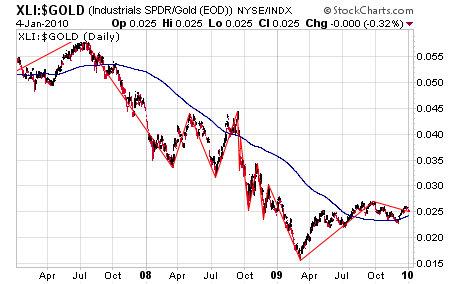
This refreshes a comment I made some months ago on Calculated Risk.  What if we looked at the current market using the same approach that prevailed in 1929-1932?  Instead of the “Dow 30” (which is officially still called the Dow Jones Industrial Average, but no longer actually contains primarily industrial stocks), let’s use the S&P 500 Industrials (ticker: XLI) as a proxy for the health of the wealth-producing part of the economy.  There may be better choices, since this doesn’t include Tech, materials or utilities, but it will do.  Also, instead of using the current (fiat) dollar as the pricing unit, we should use the same one used in 1929-1932, which was gold.  Back then there was a fixed exchange rate between the dollar and gold.  I’m not a gold bug, but the truth is that since 1930 the dollar has evolved quite a bit, and gold is still … a chemically pure heavy metal useful for jewelry and electrical circuits, hard to produce and easy to identify, thus useful for stockpiling “value”.

So, here’s the chart!  Anyone see a recovery here yet?  Looks to me like the Dow Theory folks, if they hadn’t forgotten that the Fed-manipulated fiat “dollar” isn’t the right metric, would agree that this shows no sign yet of returning to a bull market.  The automatic ZigZag feature of StockCharts still shows lower lows and lower highs…

S&P 500 Industrials, Priced in Gold, 2007-2009