Archive for January 7th, 2010

A Quick Guide to Squid-Free Banking

Thursday, January 7th, 2010

Over on Calculated Risk, a commenter asked:

So I have a checking account with Citi. Use it mainly for direct deposit and some bill paying. If I wanted to move to a small local bank, how would I find a safe one in my area(LA/OC)? I’ve tried searching online to find some kind of list or ranking of small banks, but could never get anywhere.

I replied with the following:

Three suggestions, but you’ll have to find what works for you on your own:

First, you can check with the National Credit Union Administration: Find a Credit Union
… if you are so inclined, you can actually view each credit union’s detailed financials. The credit unions are nonprofits (AFAIK) and tend to lend locally. They are all federally insured, much as banks have FDIC insurance. You can even check each CU’s local vs. nonlocal lending in the financials, after doing some homework.

Second, you might try looking on bankrate.com to find out which banks are lending in your area. Some of them will be small local banks.

Third, you might try here: Find Bank (and enter something like “metro:los angeles”). The list that comes up will be sorted by size (total loans, right hand column). Scroll down to find the smaller banks, then look at the detailed bank reports on the site… try to find banks with a lot of “green” stats (healthier than average).

Finally, when you do pick a bank, make sure they’re not on the list that CR posts weekly, or on this list: Troubled Bank List

Good hunting!

P.S. Another commenter chimed in with http://moveyourmoney.info/ . Personally I think my method is more “safe and sound”, but it also requires more work. The good news is that there’s clearly a market for this kind of information, so I expect more sites will be supplying it!
Update on Weekly Claims, Jan. 7, 2010

Thursday, January 7th, 2010

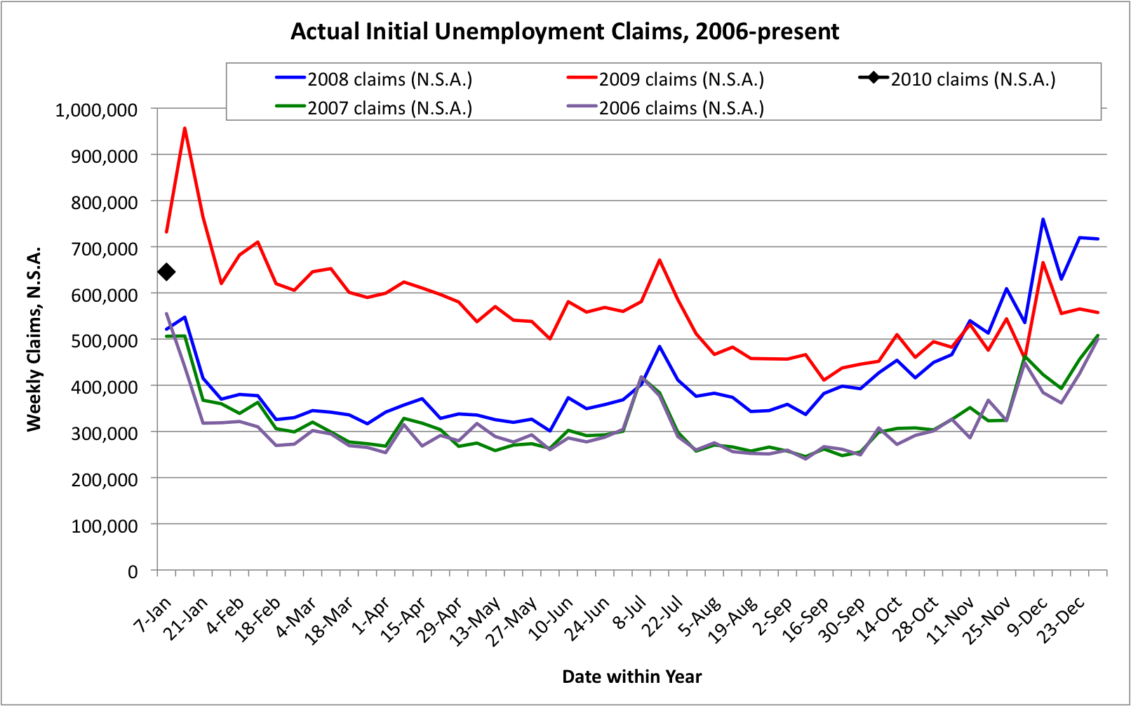
There are long-running debates about how best to evaluate the weekly Initial Unemployment Claims data. Here I present the data from 2006 on, without any “seasonal adjustment” massaging. By giving each year its own color, the graph below enables each week in one year to be easily compared with the similar data from other years. (“Seasonal adjustments”, in addition to being less transparent, also tend to give inaccurate results at economic turning points and duringrecessions, when the labor market behaves differently than during normal growth.)

Weekly Unemployment Claims, 2006-2009, Not Seasonally Adjusted

Viewing the graph, the Weekly Claims data for 2006 (purple) and 2007 (green) are quite similar, and show the “growing economy” pattern. Claims stay near or below 300,000, except for seasonal spikes in mid-July, late November (Thanksgiving), and at the calendar year boundary from late December into January.

The Great Recession is visible starting in early 2008 (blue), with the 2008 data consistently running above the 2007 data.  The deep crisis of late 2008, with claims above 600,000 during the calendar year boundary, continues into early 2009 (red). Claims remained high throughout 2009, and are still high as seen by the first week of 2010 (black).

The most recent claims data, a preliminary number for the week ended January 2, sits about midway between the early 2009 “panic” level, and the 2006-2008 “healthy economy” level, and is comparable to the “worst” levels of the 1990-1991 and 2000-2001 recessions.

So is the economy “getting healthier”, or “still sick, just not dying”?  Perhaps only time will tell.  But for a real recovery, I suspect what will be needed are not only fewer unemployment claims, but more highly productive jobs.